

Project: Lifestyle Application, added features
Roles: Product Designer, UX Researcher, UX/UI Graphic Designer
Tools: Figma, Figjam
Background
The Conqueror Virtual Challenges is a fitness app which helps people complete fitness goals through converting workouts into progress in virtual races.
The street view feature allows users to virtually immerse themselves in the trail and learn about different geographical locations.
01. Discover
PROBLEM - RESEARCH -INTERVIEWS
Problem
Although reward postcards feature in the app includes interesting location details, the lack of map integration creates friction—users have to look up addresses in another app, then return to The Conqueror to find them manually, disrupting the experience and reducing engagement.

Research Goals
1. To learn more about what people find motivating when it comes to their fitness journeys
specifically gamification and rewards in fitness apps
2. To gain insight into how users use and interact with fitness apps
Research Methods
Competitor analysis
User interviews
Affinity mapping
Competitive Analysis
Insights gained from researching and analyzing competing virtual race apps (Pacer, Medal Mad, & Challenge in Motion):

Themed races that match varied user interests (popular culture, historical and/or religious, etc.)
User progress unlocks green rewards (planting trees, cleaning up ocean plastic, etc.)
Ability to complete races with team members

Some race options have limited or no street view
Hinders full immersion

User Interviews
Five participants ranging in age from 33-70 who use fitness apps were interviewed.
Key Insights
Fitness Apps

Users felt fitness apps boosted their motivation, especially by supporting routine accountability
User Values

Data-Driven Users
Want precise, scientific measurements from multiple apps
Prefer customizable workouts
Casual Users
Prefer a single app for accountability
Favor pre-made workouts
Desires

In-app rewards like badges or achievements
Visible progress data showing results
External rewards like gift cards or points
02. Define
PERSONAS

Build Empathy
After analyzing the data collected from the competitive analysis and user interviews, I created two distinct personas representing different types of user desires for fitness apps.
Annika
Uses multiple fitness apps to collect data in order to motivate her to make progress toward her specific fitness goals.

Rochelle
Uses a fitness app in order to give her motivation and accountability in her fitness journey to be generally more healthy.

03. Ideate
HMW - FEATURE CONCEPT - USER FLOWS

How Might We…
How might we improve map and street view interactions to address user pain points?
How might we better incentivize user retention for The Conqueror app?
Constraints
Designs must adhere to the current design system for the app
Time limitations (5 weeks)
UX team of one
Feature Concept
After creating a feature matrix it became evident that the features I needed to design to enhance user interaction and incentivize user retention for The Conqueror app were:
Badges

An indication pop up on the map after a postcard reward is unlocked,
Which would allow users to easily find the places of interest mentioned in the post cards on the street view feature
Without having to put in extra work or exit the app
Map Indicators
Points of interest from multiple challenges can be collected to earn badges:
Naturalist: Natural landmarks such as rock formations and waterfalls
Historian: Points of historical interest
Foodie: Famous restaurants or food districts
Architect: Buildings with noted architectural significance

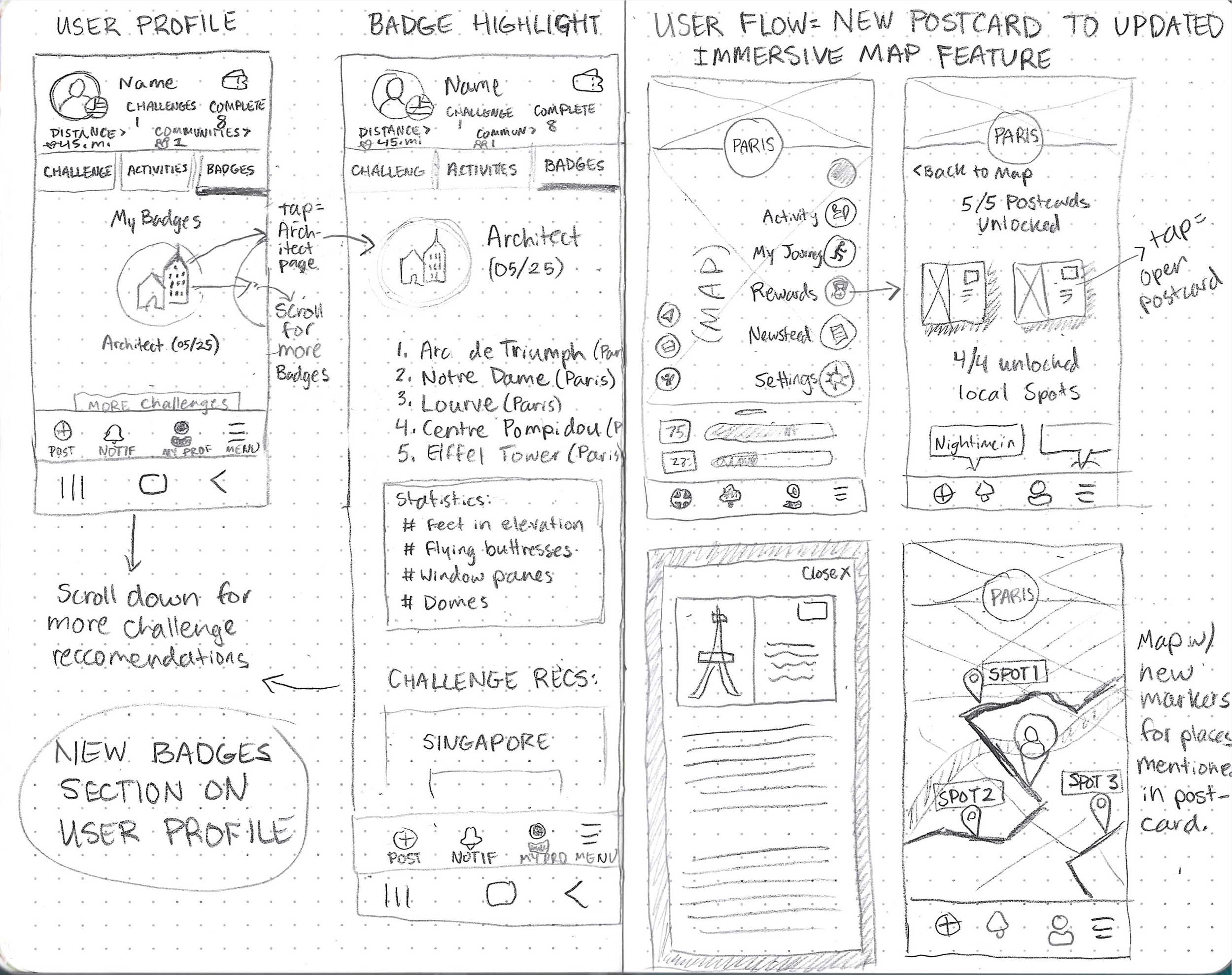
Visualize
With my feature set defined, I created user flows to illustrate possible user journeys for using the map indicators and checking progress toward earning a badge:
User Flows
A possible user journey for the map immersion feature and checking progress on earning a badge

04. Design
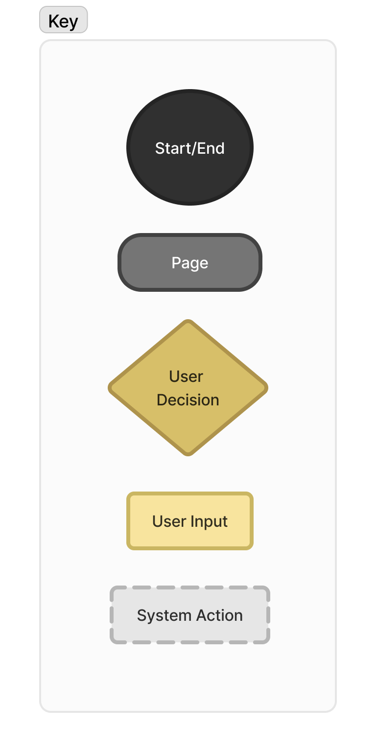
LO FI WIREFRAMES - BRANDING

Lo Fidelity Wireframes
The sketches below illustrate the initial planning of various screens involved in using the map indicators and checking progress toward earning a badge.

Style & Branding
I designed rewards for the fitness app’s gamification that align with the established branding, ensuring a cohesive user experience that motivates without disrupting the overall design language.

Badge Design
To keep the design of the badges consistent with the current branding I used the official Conqueror Gold color and vector art to mimic the style of the logos for each race.
05. Prototype
HI FI WIREFRAMES

High Fidelity Wireframes
I used feedback I received from peer groups and my mentor to translate the low fidelity wireframes into high fidelity wireframes.
1 - Check on badge progress


Badge Progress
The badges menu shows the user's progress for each badge, using different levels of contrast to represent the progress in the form of a pie chart.
Users can scroll horizontally to see their progress on each badge.
Badge Info
Users can click on each badge to activate a popup which gives them more information and statistics related to the theme of the badge.
2 - Explore the map


New locations added
These screens illustrate the user flow for receiving a new reward postcard and then returning to the map after reading about the places visited in the virtual race.
New location markers appear on the map, indicating where these points of interest are.
If the user wishes, they can click on the markers to explore these areas further using the street view feature.
06. Test
USABILITY TESTING

User Testing
I conducted comprehensive usability testing with a group of five users familiar with fitness apps. By observing their interactions and gathering feedback, I was able to identify pain points and areas for improvement.
1 - Check badge progress
“In this scenario you want to check your progress earning The Architect badge. How might you go about that, starting from the user profile screen?”

User Feedback

Badges looked consistent with the design of the app
The contrast gave a quick visual idea of your progress
The statistics on the badge info page
Offer for more challenges that would help you complete the badge

Several users favored the phone’s “back” navigation instead of the in-app navigation
2 - Explore the map
“In this scenario you have unlocked a reward postcard which tells you about places you’ve virtually visited. From here, how would you find your reward and explore the map afterward?”

User Feedback
Users enjoyed the street view feature
Some users missed the notification circle on the rewards section of the sidebar menu & postcards
Some users didn’t notice the new location markers on the map at first.
“It should be more obvious that they are a new thing on that screen.”
07. Iterate
TARGETED ITERATIONS
Targeted Iterations
This iterative process helped me figure out how to refine the wireframes:
Make the notifications more obvious
Make the new map location markers more obvious
1. Resizing of Notifications
In an attempt to make the notifications more obvious, I resized them:
Original

Redesign

2 - Animation Added
The new location notifications on the map had a short animation which swelled to a larger size with outline detail when users first encounter the screen after unlocking a postcard:

08. Next Steps
ADDITIONAL FEATURES

Additional Features
Based on user feedback I received during interviews and testing, some user desires for the badges and improved map exploration are:
More Badges
Which could be unlocked after completion of the initial four, some examples might be:
Paleontologist (for sites with fossils and geological interest concerning ancient life)
Archaeologist (For sites which have significance concerning past human civilizations)
Custom Icons

The location marker icons could be redesigned to show which badge they go towards collecting
09. Conclusion
REFLECTION - HOW I’VE GROWN - IN THE FUTURE

Reflection
In conclusion, the addition of the new features have successfully enhanced the overall user experience
by introducing elements of delight and gamification,
while maintaining seamless integration with the app’s preexisting design system.
By carefully balancing innovation with consistency, I was able to elevate the app’s functionality without disrupting its intuitive flow or aesthetic.
How I’ve Grown

This project taught me the importance of gathering outside perspectives through user testing
I can’t always assume what looks obvious to me might not appear obvious to someone who is seeing the design for the first time.
I also was able to learn more about prototyping animation effects in Figma and enjoyed adding an element of delight to my design.
I also found that I enjoyed working within an already established design system, so I could focus more on the UX aspect instead of having to create a visually pleasing UI from scratch.
In the Future…

I want to continue to develop my design and prototyping skills in Figma.
I also want to focus on ensuring that my design choices are clear and intuitive to users, especially in situations where clarity is essential.
By prioritizing simplicity and directness when needed, I aim to make sure users can easily understand how to interact with the app, without confusion or hesitation
My recent work


