

Project: Responsive website
Roles: Product Designer, UX Researcher, Brand Identity Developer, UX/UI Graphic Designer
Tools: Figma, Figjam
Background
Metro Denver Farmers’ Market has a 40 year history of serving the Metro Denver community, making it the oldest farmer’s market in the Denver area. Many of the farmers who sell at the market are generational Coloradoan farmers. Over 45 local merchants sell at the market, which operates every weekend during the spring, summer, and fall months.
01. Discover
PROBLEM - RESEARCH INTERVIEWS
Problem
Metro Denver Farmers’ Market’s existing website suffers from an outdated design, cluttered layout, and confusing user flows that often redirect users off-site without a clear path back, disrupting task completion

Research Goals
Understand users’ emotional landscape concerning farmers’ markets
Identify digital tools on which users rely
Uncover perceptions of the current Metro Denver Farmers’ Market website, including pain points and desired features
Research Methods
Competitor analysis
User interviews
Affinity mapping
Competitive Analysis
Insights gained from researching and analyzing competing local farmer’s market websites (Arvada, Boulder County, & Golden):

Market schedule & locations
Vendor information,
Vendors attendance for upcoming markets
Online ordering/pre-ordering (When available)

Some sites had poor navigation
Missing crucial elements like a contact page
Outdated information or inconsistent vendor listings

User Interviews
Five people within the age range of 24-62 who either are vendors at a farmers market or customers who shop at farmers markets were interviewed.
Insights Gained
Emotional Landscape

Users Enjoy:
Higher quality purchases
Supporting local farms and businesses
Communal atmosphere
Thrill when finding a unique item
Pain Points:
Crowding and heat
Digital Tools

Four out of five users:
Local market websites
One user:
Next Door app
As well as local websites
Current MDFM Website

Desires

General
Update and simplify the UI
Vendor’s page
More pictures
Better descriptions
Links to their individual websites
Attending vendors page
Pain Points

General UX & UI
Visually cluttered & outdated
Newsletter sign up is unclear
Unnecessary links and duplicate pathways
Vendor’s Page
“MDFM: Legends” title was confusing
Long list with no photos
Links are outdated/broken
No way to view attending vendors
02. Define
PERSONAS

Build Empathy
After analyzing the data collected from the competitive analysis and the user interviews, I created two distinct personas representing the differing desires and tasks for the MDFM website.
Fred
A local vendor who relies on the farmers market website to reach his customer base and direct web traffic toward his business site.

Erika
A farmers market customer who desires fresh, high quality produce and to support local businesses and minimize her ecological footprint.

03. Ideate
HMW - FEATURE CONCEPT - MAP - FLOW

How Might We…
How might we optimize key tasks for vendors and customers to boost efficiency and profitability?
How might we modernize the homepage with a cleaner UI and streamlined UX?
Constraints
Time limitations (5 weeks)
UX team of one
Keep the established brand colors
Purple & orange
Feature Concept
After creating a feature matrix it became evident that the most essential functions for the MDFM website are:
Tools for attendees like schedules, maps, and attending vendors
Tools for vendors like redesigned vendor rules, application, and featured vendors page
Key Screens
Schedule & Location

Cleaner UI
accurate map locations
Vendor List

An accurate list of the vendors with better UI
Which vendors will be attending each market
Vendor Tools

Redesigned vendor rules & application

Visualize
With my feature set defined, I created a site map for the redesigned website.
The number of navigation options was reduced from seven to four and several similar areas of the site were streamlined and condensed.
Based on time constraints, card sorting and tree testing were not conducted.
Site Map

User Flow
I also created a user flow of a possible user journey while applying to become a vendor.

04. Design
LO FI WIREFRAMES - BRANDING

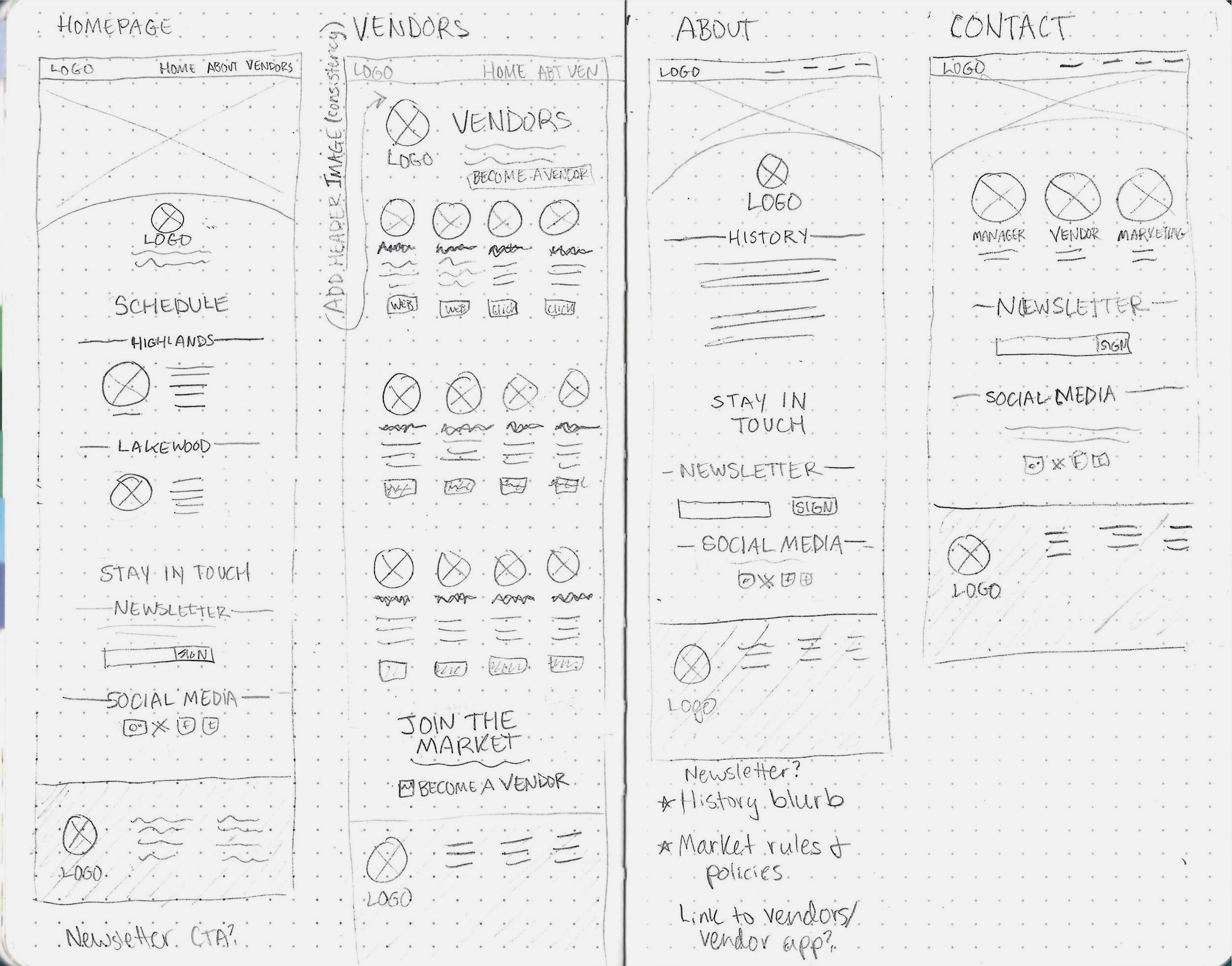
Low Fidelity Wireframes
The sketches below illustrate the initial planning of the pages of the MDFM website redesign.

Style & Branding
Updating MDFM’s online presence with a fresh modern look was going to require a redesign of the existing logo in order to reflect a more contemporary aesthetic.
Logo Redesign
The original logo was a detailed, colorful depiction of produce with a blocky typeface. For the redesign
I simplified the logo to a semi-abstract farmland image
And blended the modern visuals with a traditional serif typeface
I chose Kaisei HarunoUmi, for its soft curves and calligraphy-like strokes
The brand purple from the original website was retained as requested.
Original

Redesign


UI Kit

I designed menus, buttons, form elements, and components for the redesign using the brand colors from the original website.
05. Prototype
HI FI WIREFRAMES

High Fidelity Wireframes
The original screenshots of two key screens along with the wireframes for the redesign.
Home Page
I took inspiration from the original design with the produce inspired hero section and brand color scheme. For my revisions I
Gave the design room to breathe with intentional whitespace
Added images with the different market locations
Made the newsletter sign up more prominent
De-cluttered the design by replacing the embedded social media feed with icons


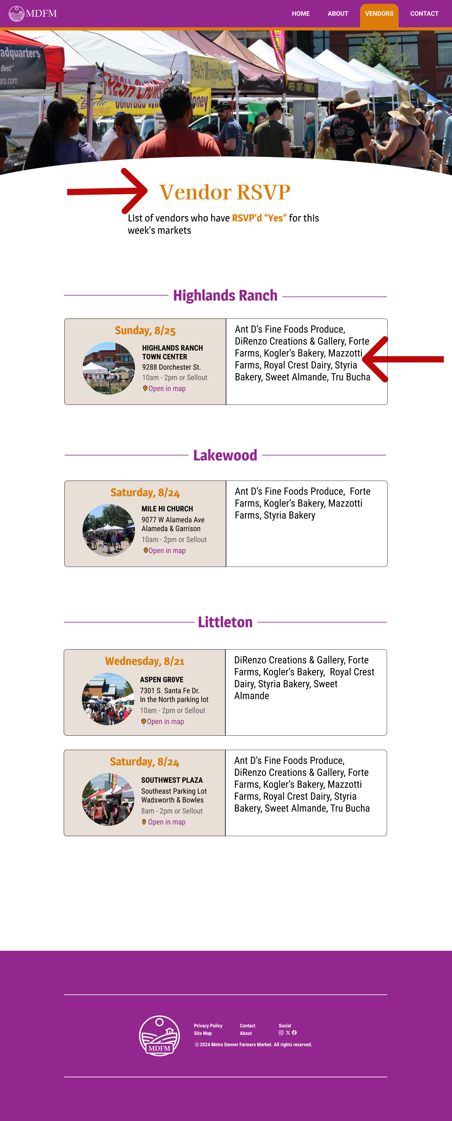
Vendors Page
Original
Redesign
Redesign
Original
I took the same inspiration from the original design for the vendors page. For my revisions I
Changed the name of the page for brevity from “MDFM Legends” to “Vendors” based on confusion expressed during user interviews
Changed the long list format to a grid with photos
Added relevant vendor-related links to the bottom of the page to increase usability


06. Test
USABILITY TESTING

User Testing
I conducted user testing with a group of five users who were familiar with farmers’ markets. By observing their interactions and gathering feedback, I was able to identify pain points and areas for improvement.
1 - Check vendor attendance
“In this scenario you want to check to see if Mazzotti Farms will be present at the Highlands Ranch location for the market on August 25th. How would you go about doing that starting from the home page?”

User Feedback

The photos are engaging and encourage further exploration.
The logo design is appreciated for being simple, effective, and
distinctive with its unique color, standing out from other markets.

"Vendor RSVP" wording caused confusion
User suggestions for the vendor attendance page
Split page into one for each market
grid format with photos
filtering option for specific dates
2 - Find contact information
In this scenario you want to find out who to contact for marketing related questions in regard to Metro Denver Farmers Market. How would you go about doing that starting from the home page?

User Feedback
The layout and navigation were simple
Things were where they were expected to be
Information was easily accessible
No suggestions for improvement were given for this task flow
07. Iterate
TARGETED ITERATIONS

Targeted Iterations
By prioritizing insights from user testing I made targeted iterations to the designs, enhancing usability and addressing any pain points.
Confusing wording was revised
A page was redesigned for consistency
1 - Revised Wording
Original Design

Button reads “Vendor RSVP”
Users were under the impression that
The button was for vendors to RSVP with market staff
Instead of for users to check the attending vendors
Iterated Design

Button reads “See Vendors”
I used brief, more direct wording to improve clarity for users
2 - Attending Vendors Page
Original Design
User pain points:
It was hard to find vendors in the list
Design was inconsistent with the rest of the site
There was no way to change the date
All markets being on the same page was confusing
Iterated Design

To enhance usability I:
Split the page into different pages for each market
Re-named the page “Attending Vendors” for clarity.
Added a drop down menu to change the date range
Used a grid style system with photos for continuity with the rest of the site
08. Next Steps
ADDITIONAL FEATURES

Additional Features
After the launch of the redesign, several new features could be added. Based on user feedback I received during interviews and testing, some delightful user desires for the MDFM redesign are:
Recipe Section

Which highlights in-season produce sold at the market
Vendor Map

A map of each individual market showing which vendors is at which stall
09. Conclusion
REFLECTION - HOW I’VE GROWN - IN THE FUTURE

Reflection
I gained satisfaction in helping to update a local business’ digital presence while still maintaining a unique brand identity.
The iterative process based on feedback from users, peers, and my mentor illustrated that good design is a process that keeps evolving based on changing user preferences and needs. I was able to iterate on my designs in order to make them as clear, concise, and intuitive as possible.
How I’ve Grown

I feel I was able to implement the effective elements of design patterns I’d gathered for inspiration while maintaining an original and distinct brand identity.
The responsive design also challenged me to think about breakpoints as I built the pages, cards, and components.
In retrospect, I wish I’d had the time for card sorting
So I could have had a better idea of the type of wording users instinctively leaned toward
In the Future…

I’d like to continue to design with responsivity in mind, knowing that my design might be viewed and used on a different screen size.
I want to continue to design based on insights gleaned from user research,
And translate their needs into useful, useable, and desirable designs
Which highlight the best aspects of the product and brand


