

Project: Accessibility Audit & Design Suggestions
Roles: Accessibility Specialist, UX/UI Graphic Designer
Tools: Heurio, Dev Tools (Lighthouse), Figma
01. Discover
PROBLEM - DATA - BEST PRACTICES
Background
Veronica's Insurance offers insurance solutions, including auto, home, and life coverage. With a focus on customer satisfaction, the company provides tailored policies and transparent service.

Problem
Veronica’s Insurance’s current website is not supporting usability or accessibility issues to the detriment of users with visual impairments and/or assistive technologies which is causing barriers to engagement with content and completion of tasks.
By enhancing the website’s accessibility, Veronica’s can improve access for all users and expand its customer base.

Data: Low Vision
Low vision refers to significant visual impairment that can't be fully corrected with glasses, contact lenses, or surgery.
About 3.56% of the population (285 million people globally) is affected by low vision.
Many people with low vision use assistive devices or technologies like
a white cane for mobility
and screen readers for navigating digital spaces
Sources
World Health Organization
The US Government’s Center for Disease Control
The UK Government’s Civil Service
Best Practices: Low Vision
Visual Design

Ensure sufficient color contrast
Avoid relying on color alone to convey meaning
Support zooming and text resizing
Use scalable, legible typeface
Provide a dark mode option
Screen Reader

Use semantic HTML
Provide descriptive alt text for images
Label all form inputs clearly
Ensure logical focus order
Provide skip navigation links
Avoid auto-playing media
Sources
Web AIM (Screen Reader User Survey)
W3C Web Content Accessibility Guidelines (WCAG) 2.1
Nielsen Norman Group – Low Vision Accessibility
02. Define
PROTO-PERSONA

Build Empathy
After analyzing the data, I created a proto-persona representing a user with low vision for Veronica’s Insurance.
Jay Jay
Jay Jay is a data analyst from California with low vision (central vision loss) who wishes to purchase health insurance.

03. Ideate
HMW - ACCESSIBILITY REVIEW - KPI

How Might We…
How might we optimize the UX/UI in order to expand accessibility for users with visual impairments and ensure compliance with current accessibility web standards?
Constraints
UX/UI must integrate with established branding

Heuristic Accessibility Review
I conducted a heuristic review and accessibility audit to identify usability issues and barriers that could prevent users—especially those with low vision—from successfully interacting with the product.
These evaluations helped me assess the design against established usability principles and accessibility standards.
By uncovering these issues, I was able to make informed design improvements that benefit all users.
Evaluation Tools
Heurio
I used Heurio to conduct a heuristics evaluation based on Jakob Neilson’s 10 Usability Heuristics

Lighthouse
I used the Lighthouse feature in Dev Tools to conduct an accessibility report
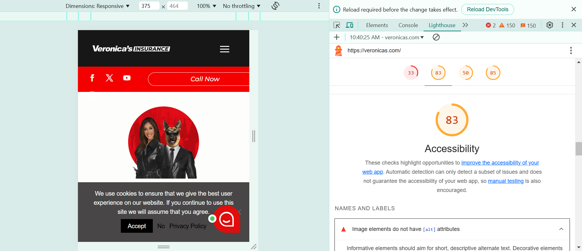
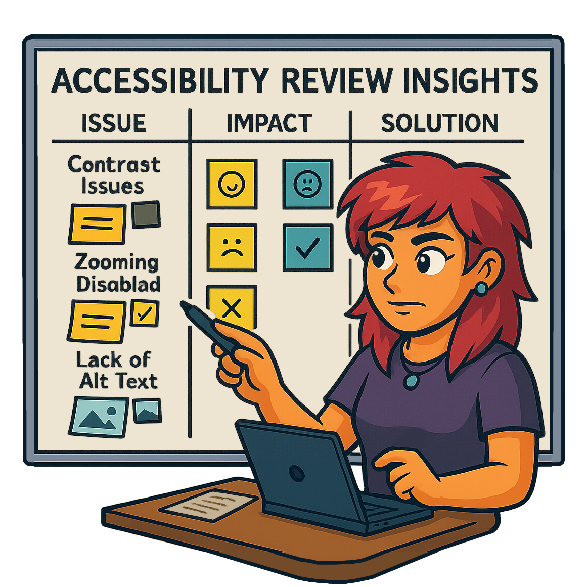
Insights
Through the accessibility audit, I gained valuable insight into how certain design choices could create barriers for users with low vision. Evaluating the interface with this lens allowed me to spot areas that fell short of accessibility standards.
These findings highlighted the importance of designing with flexibility and inclusivity in mind, ensuring the product remains usable for all individuals regardless of visual ability.
There are several contrast issues,
which can hinder readability for users with visual impairments

Some headings do not descend logically (H1, H2, H3, etc),
which can cause issues with screen readers being able to properly engage with content
Some images lack alt text, and some elements lack accessible names
which can interfere with usability for users with assistive technologies

Zooming is disabled,
which can cause issues for users with low vision
Key Performance Indicators
Accessibility & WCAG compliance
A contrast ratio of 7:1 to meet WCAG AAA status will be reached on 100% of website buttons by the end of the quarter.
Assistive technology and information architecture
100% of pages will have logically descending headings (H1, H2, H3, etc) in order to make the page accessible to users with assistive technology by the end of the quarter.
04. Design
VISUAL SUGGESTIONS

Accessible Design
Building on key insights from the heuristic accessibility review, along with identified usability gaps and relevant KPIs, I developed targeted design recommendations aimed at improving both accessibility and overall user experience while blending naturally with existing branding.
Visual Design Suggestions
1 - Adjust Contrast
By adjusting the contrast to a ratio of 7:1 or higher (in order to earn a AAA WCAG rating) on user interface elements like buttons, usability is improved for all users.

New ratio
The button now has a ratio of 9.98:1, according to the WebAIM contrast checker.

2 - Heading Hierarchy
By changing the heading to descend in a logical manner (H1, H2, H3, etc.)
the page is made more accessible to users with assistive technologies like screen readers
and the information architecture is improved.
The contrast was also adjusted, improving readability for all users.

These changes integrate seamlessly with the existing branding.

Other Design Suggestions
Add alt text to images and give elements like buttons accessible names
to make the website more accessible for assistive technologies
Enable zooming to make the website more accessible for users with visual impairments
05. Conclusion
REFLECTION
In summary, small changes which integrate seamlessly with existing branding can enhance accessibility and usability for all users.
Reflection
Ever since my days as an educator teaching a diverse population of students such as:
English language learners,
those who are gifted and talented,
and those with special needs,
I have known that creating accessible content is a passion of mine.
Just like I helped teachers make small changes to their instruction and curriculum in order to make it more accessible to all students,
some of those same ideas apply when it comes to UX/UI design.

While completing the Advanced Usability & Accessibility course by DesignLab I gained satisfaction in
learning how to identify potential inaccessible aspects of digital products
and ways in which they can be corrected with minimal effort and maximum effectiveness,
increasing usability not only for the affected group but for all users.
How I’ve Grown

I have gained knowledge when it comes to best practices in accessible design, as well as how to identify and correct inaccessible design and keep up with changes in standards.
In the Future…

I’d like to continue to design with accessibility from the start, and advocating for the needs of all users when it comes to product development and design.
I want to continue to keep up with the latest in accessible design standards and best practices.
My recent work


