

Project: Lifestyle Application, end to end app development
Roles: Product Designer, UX Researcher, Brand Identity Developer, UX/UI Graphic Designer
Tools: Figma, Figjam
01. Discover
PROBLEM - RESEARCH -INTERVIEWS
Problem
Because everyone reacts differently to cannabis, it can be difficult to find products which are right for you.
There are thousands of products, hundreds of strains, and many varying consumption methods and dosages, creating countless combinations and effects.

Research Goals
To understand user attitudes, pain points, and needs regarding cannabis-related technology, and identify the most essential functions of digital tools that support their cannabis use.
Research Methods
Competitor analysis
User interviews
Affinity mapping
Competitive Analysis
Insights gained from researching and analyzing cannabis-related websites (WeedMaps & Leafy) and apps (Strainprint & ReLeaf):

Strain descriptions and their estimated effects on users
Tracking and the ability to log how strains affect them

Mismatch between online listings and in-store availability
Estimated effects often don’t reflect individual experiences
Limited app databases hinder effective session tracking
User Interviews
Five people within the age range of 26-70 who use cannabis for medicinal, spiritual, or recreational purposes were interviewed.

Insights Gained
Cannabis Use

Beneficial effects:
Management of pain, anxiety, & sleep
Enhancing experiences.
Complaints:
Discomfort from too high a dosage
Inconsistent effects due to variables
Unwanted drowsiness
Digital Tools
Current Use:
Look up strain info & deals
None currently using a tracking app.
Desires:
Ability to add a product if it is not in the database
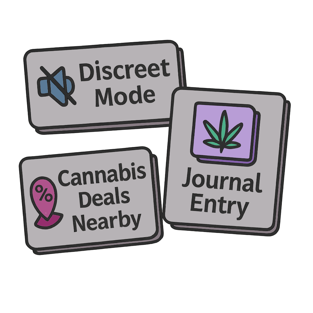
Discretion in app design
Data security & privacy
Essential Functions
Tracking:
Reason for use, strain information, method of consumption, dosage, & effects
Desires:
Ability to edit a session at a later time with further insights
02. Define
PERSONAS
Build Empathy
After analyzing the data & insights collected from the competitive analysis and user interviews, I created two distinct personas representing different types of user desires for CannTrack.
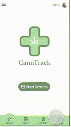
Olivia
Uses cannabis daily in order to alleviate symptoms from a chronic medical condition who hopes to use data to find the best strain, dosage, and consumption method for her needs.

Mary
Is new to cannabis use and finds all the options overwhelming. She needs help figuring out what she likes and what she doesn’t like when it comes to different types of cannabis products.

03. Ideate
HMW - FEATURE CONCEPT - MAP - FLOW

How Might We…
How might we help cannabis consumers avoid overwhelm when choosing products?
How might we help users better predict their individual cannabis effects?
Constraints
Time limitations (MVP in 5 weeks)
UX team of one
Feature Concept
After creating a feature matrix it became evident that the most important functions of CannTrack are:
The ability to log and track a cannabis session and its effects
The ability to access and interpret this data.
Key Screens
Track a Session

Record data about the product
And the effects felt after use
History

View past sessions
And edit them (add a note, etc.)
Data

View data in different ways:
Statistics
Filters
Visualize
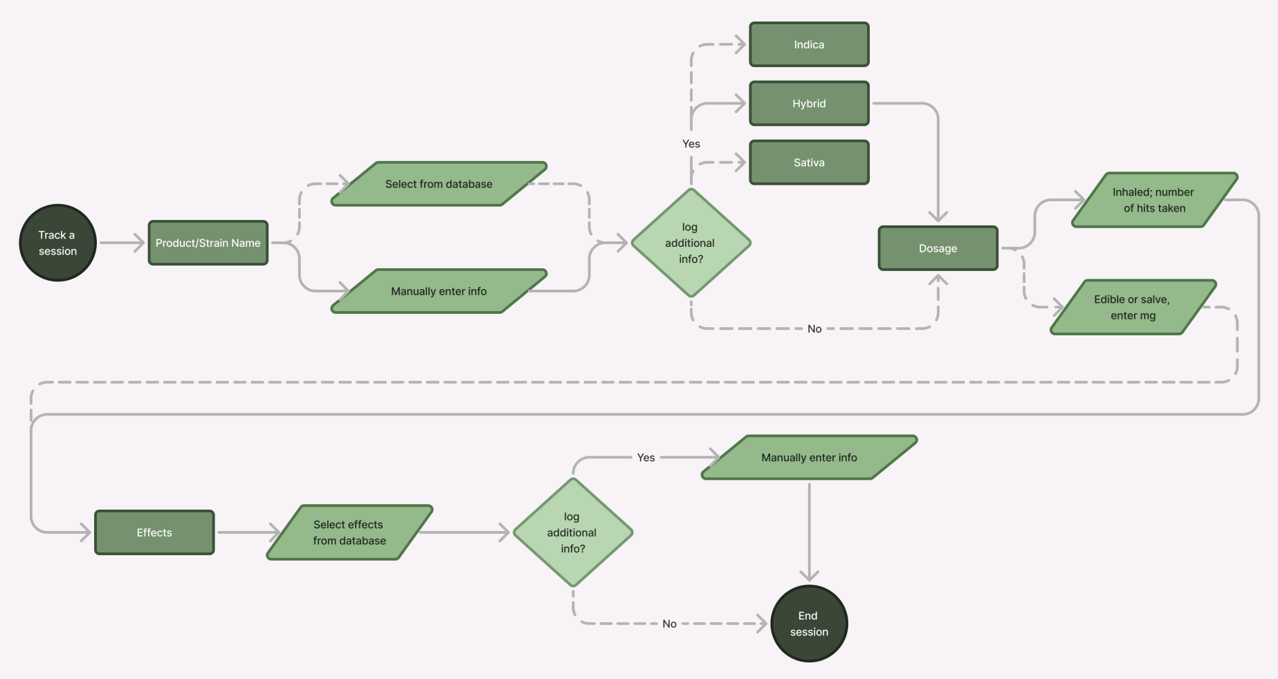
I created a site map and user flow to clarify the structure of the product and ensure a smooth, intuitive user experience. These tools helped visualize key interactions, identify potential friction points, and guide design decisions around navigation and task completion.

Site Map
User Flow
A possible user journey for tracking a session
04. Design
LO FI WIREFRAMES - FEEDBACK - BRANDING

Lo Fidelity Wireframes
The wireframes include notes on ideas I had during planning as well as suggestions from peers in group critiques.

Initial Feedback
Some positive feedback and suggestions for growth from peer critiques and my mentor:

Useful, original app concept
Detailed but manageable data logging
Sessions can be edited or expanded later
Step-by-step tracking form

Start with the symptom being treated
Add a progress bar to the tracking form
Enable typeahead search in databases
Use dropdowns instead of radio buttons for long lists
Before I began creating my high fidelity wireframes I knew that I needed to create a unique style and brand identity for CannTrack.
Style & Branding

Inspiration

I wanted to take design notes from a high-end dispensary, using whites and shades of muted greens.
User interviews indicated that discretion and privacy was important when considering the app’s design.
I leaned more into the medicinal aspect of cannabis for the logo, which is a green cross (commonly used to indicate a dispensary).
UI Kit

I designed menus, buttons, form elements, and components for CannTrack
05. Prototype
HI FI WIREFRAMES

High Fidelity Wireframes
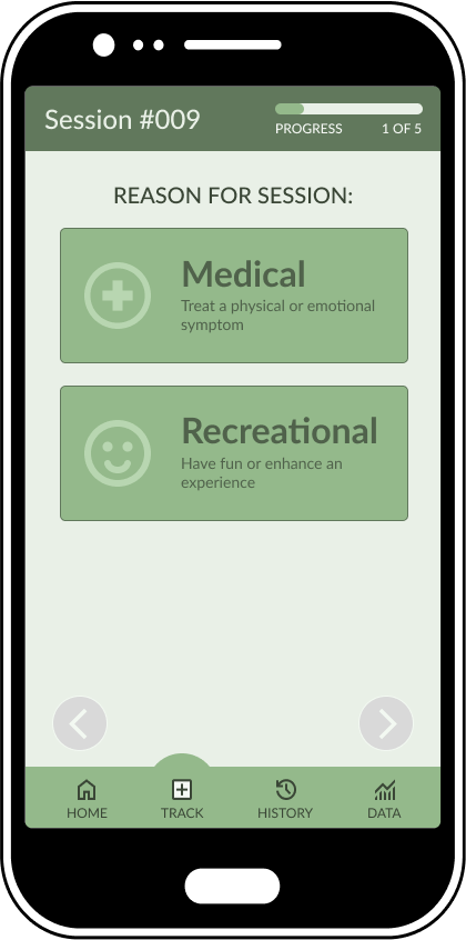
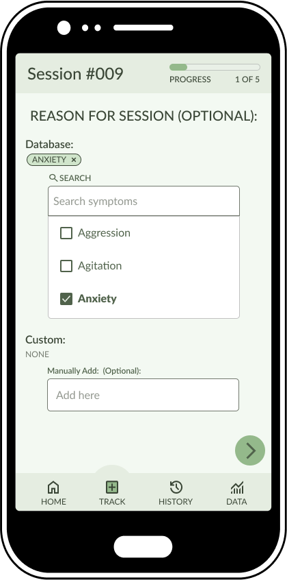
The screens featured in the most important feature of the app- tracking a session.
Product Information
The user has already selected the required product name and is able to add optional additional information like the product type and genetic dominance.

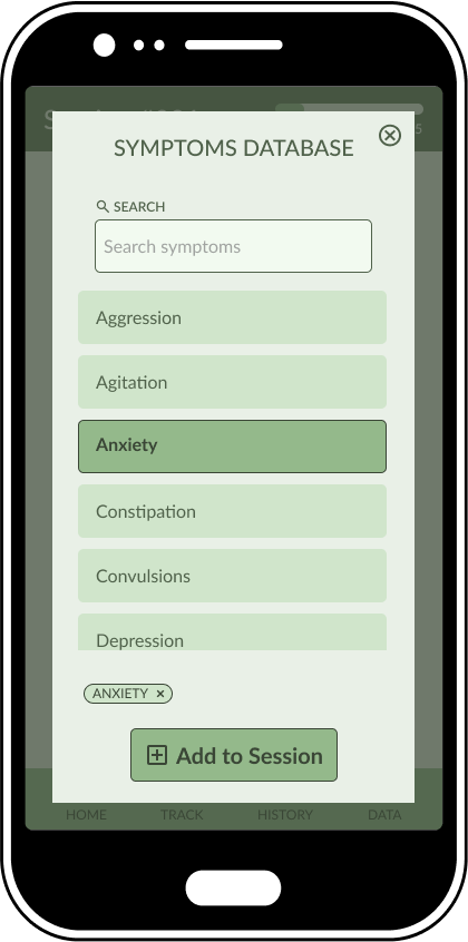
Symptom Database
The user can either scroll through or search the database of common symptoms treated with cannabis and add one or more to be tracked in the session.
Effects Intensity
The user can select between three levels of intensity for effects logged in the session.
They can select additional effects from the database or manually add a unique effect in the text entry field.

Session Summary
The user can view a summary of the information they tracked in their session and go back to the session to edit and make changes.

06. Test
USABILITY TESTING

User Testing
I conducted comprehensive usability testing with a group of users familiar with cannabis use. By observing their interactions and gathering feedback, I was able to identify pain points and areas for improvement.
Flow 1 - Tracking a session
“In this scenario you want to track a session. How would you go about doing that starting from the home screen?”
User Feedback
The ability to add a custom product in case it wasn’t in the database
Different types of consumption methods as part of the tracking
The tracking form had optional aspects in case you’re in a hurry
The medical/recreational screen was redundant since the reason for session requirement will tell the user that info
Search prompt wording offering a suggestion was confusing, it should just have the instructions (E.g. “Search Symptoms”)
Flow 2 - Edit a previous session
“In this scenario you want to edit a previous session and add that you felt drowsiness as an effect from the cannabis.”
User Feedback
The ability to edit and add to sessions at a later time was appreciated
The layout was straightforward and easy to learn
The notes feature was good for adding things which weren’t in the form
Having to click through the entire session to edit a certain part was irritating
Condensing popup screens into embedded scrolls would streamline the process
Flow 3 - Filter your data
“In this scenario you want to filter your data to see which strains you’ve used for treating the symptom of anxiety.”
User Feedback
The ability to filter data instead of having to manually browse through past sessions was appreciated
Too many shades of green made the app look visually cluttered
The dropdown menus should be more visually similar
07. Iterate
TARGETED ITERATIONS
Targeted Iterations
Insights from user testing feedback helped me figure out how to refine the wireframes:
Make menus more visually consistent
Eliminate superfluous screens/taps.
Clean up the overall visual UI
Let users quickly edit a the specific part of the session
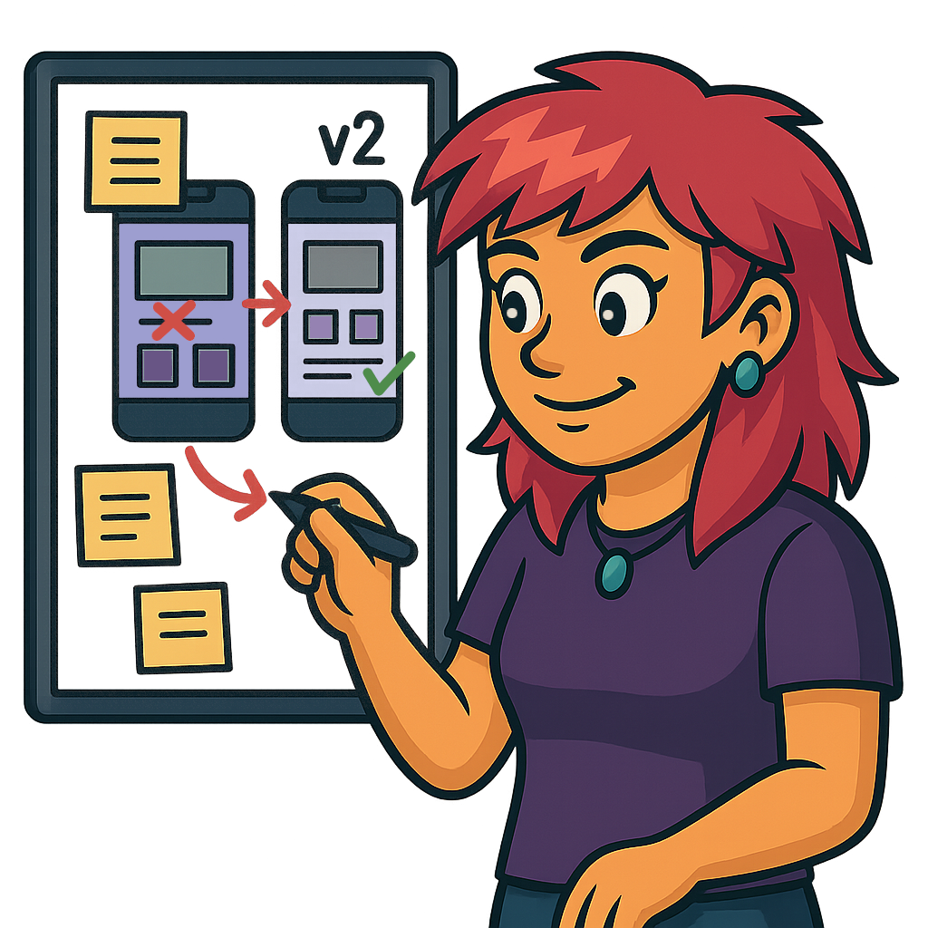
Flow 1 - Tracking a session
Original Design
The original design had three separate screens for the first step of tracking a session.


Iterated Design
Based on feedback from user testing I simplified the UI by:
combining multiple screens into one,
removing unnecessary elements like rectangles,
reducing the color palette,
and brightening the design with lighter hues.
Flow 2 - Edit a previous session
Original Design

The original design had an edit button at the bottom of the previous session popup, but it
took users to the beginning of the session
leaving users feeling frustrated by having to click through irrelevant screens
Iterated Design

I added touch targets to edit each section
which will let users jump to the specific section they want
Bypassing any irrelevant screens
Flow 3 - Filter your data
Original Design
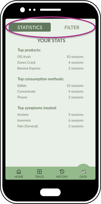
Users were confused by the design of the top menu differing in appearance from the bottom menu.
Some users thought the words “your stats” wasn’t very personalized.
Iterated Design
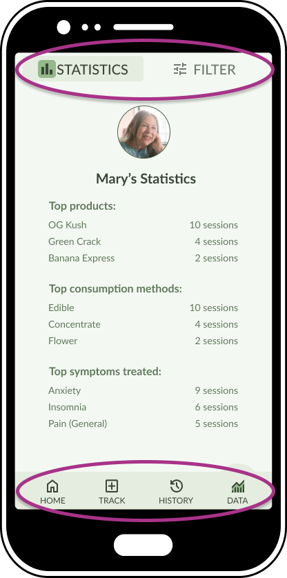
I redesigned the top menu to mirror the choices I had made with the bottom menu.
I also personalized the page by adding the user’s icon and name
08. Next Steps
FUTURE FEATURES - BUSINESS & USER ORIENTED
Future features which benefit both primary users and business interests which could be developed after launch to enhance the app are detailed below.

Business Oriented
When I was brainstorming CannTrack, I had several ideas which related to business needs, such as:
Market Research

Overview of data with insight into:
Trends in sales
Consumer preferences
Promotions

Personalized product promos and deals based on:
desired effects
consumption patterns
Sponsorship

A specific brand’s products come pre-loaded on the app
As incentive for app sponsorship

User Oriented
Ideas which were cut for time constraints and ideas which were suggested by users during testing include:
AI Chatbot

To help users filter data in very specific ways
“What strains helped my anxiety & made me relaxed but didn’t keep me couch-locked or give me dry mouth?”
Recommendations

Based on data collected from users.
“87% of users report treating anxiety with this strain”
Products with similar terpene profiles
Custom Shortcuts
For frequently logged items
Pinned to the top of searches
“Quick log” feature for similar sessions
09. Reflection
HOW I’VE GROWN - IN THE FUTURE

Reflection
Through research, iterative prototyping, and testing, I uncovered key pain points and opportunities for improvement. Feedback from users, peers, and mentors reinforced the value of ongoing usability testing.
The changes I implemented not only streamlined the user journey but also significantly increased user satisfaction and engagement.
How I’ve Grown

Working on CannTrack helped me grow my prototyping skills and better understand how UI elements support specific tasks.
I also learned to streamline my designs by cutting visual clutter and reducing screens and clicks to create a more intuitive experience.
In the Future…

Moving forward, I’m committed to prioritizing user needs and using data-driven insights to guide improvements.
This project reminded me that great UX is always evolving—and that staying curious about our users is key.
I’ll keep working to streamline my designs and grow my ability to create simple, effective interfaces.
My recent work


